
Keep updated on the latest weather trends and outlooks with Livestock Wx’s Weekly Update email. To subscribe, click here.
Oct. 4, 2019
This article first appeared on Livestock Wx and was written by Becky Bolinger. Dr. Bolinger is the Colorado Assistant State Climatologist. She is based at Colorado State University and is a frequent contributor to Livestock Wx, the U.S. Drought Monitor and tracks all things climate.
From Cool and Wet to Hot and Dry
Last week, we celebrated the autumnal equinox, and the first full week of fall began. Before we look ahead to what the rest of fall might bring, let’s look back and see how this summer ranked in terms of temperature and precipitation.
Like a doctor taking your temperature and blood pressure at your annual physical, climatologists look at temperature and precipitation anomalies as a way to assess the health of the climate over a certain time period. It doesn’t tell the whole story, but it’s a good start. The Standardized Precipitation and Evapotranspiration Index (SPEI) is a helpful index we use to combine both temperature and precipitation into one number, giving us a quick overview of conditions. Looking specifically over June-July-August (the climatological summer), this figure shows SPEI for the summer 2019 over the Contiguous United States (map below).
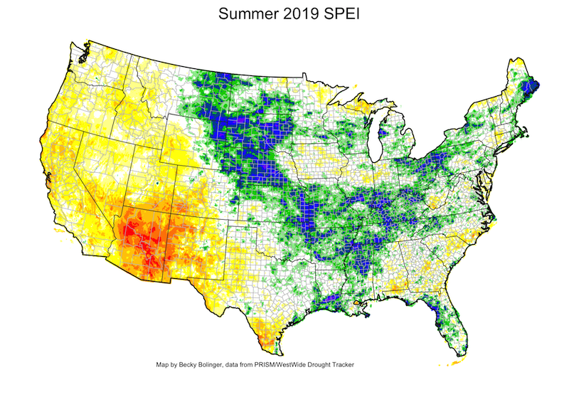
A general range from light yellow to white to light green, would indicate a more normal climate, a range of conditions that we would typically expect in that region. Areas of reds and blues highlight regions that experienced a more extreme climate. The more extreme the climate, the harder it is for that climate to return to normal, regardless of which end of the spectrum it occurs. Extremes are hard on the land and likely mean impacts.
In the blue, we’re looking at areas that experienced a combination of cold and wet, bordering on extreme. In the red, these areas experienced a combination of hot and dry. Both cases can (and did) have negative impacts on vegetation. In the southwest and around the Four Corners region, where people are still recovering from the 2018 drought, vegetation quickly became stressed and drought returned on the U.S. Drought Monitor map. A swath of blue over the central U.S. coincides with areas that have had issues with flooding and failed crops due to too much water.
The next two maps show the degree to which temperature and precipitation differed from what we would normally expect in the summer. Large areas of record heat and record dryness were observed across the southwest. Slightly cooler than average temperatures were seen across the central U.S., combined with very wet conditions (and record wet over parts of Nebraska and South Dakota).
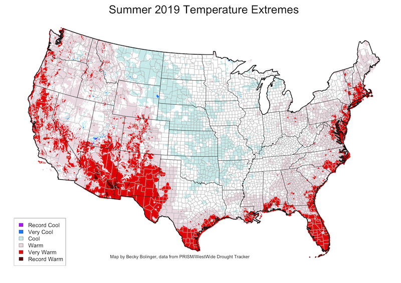
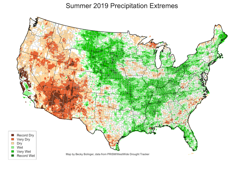
Looking at the central U.S., one might wonder why it seemed like the region couldn’t catch a break. Why wouldn’t it warm up and dry out more? Unfortunately, it’s a tough feedback loop to break. As the sun hits the ground, the ground releases energy. When the ground is moist, it releases latent heat energy, which cools the air right above it. That latent energy is also evaporating more moisture into the atmosphere. Latent heat is limiting how warm the air temperature can get and increasing the likelihood for more precipitation.
The opposite occurs when the ground is dry. A dry ground will release more sensible heat energy, which acts to further warm the air right above it and limits the generation of precipitation. Obviously, these feedbacks don’t last forever, but a persistent pattern can be more difficult to shift away from.
It’s also interesting to note how this large-scale pattern that set up in the summer dictated the occurrence of 100° days across the U.S. The maps below show the number of 100° days reported in June-September 2019. Yellow stations show where 100° days aren’t quite as common and only occurred 1-5 times this summer. A large region of the Southern Plains, encompassing southeast Colorado, western Oklahoma, and throughout much of Texas, saw between 20 and 50 days of triple-digit temperatures. In the desert southwest, it’s no surprise to see that the majority of the summer was spent over this 100° threshold.
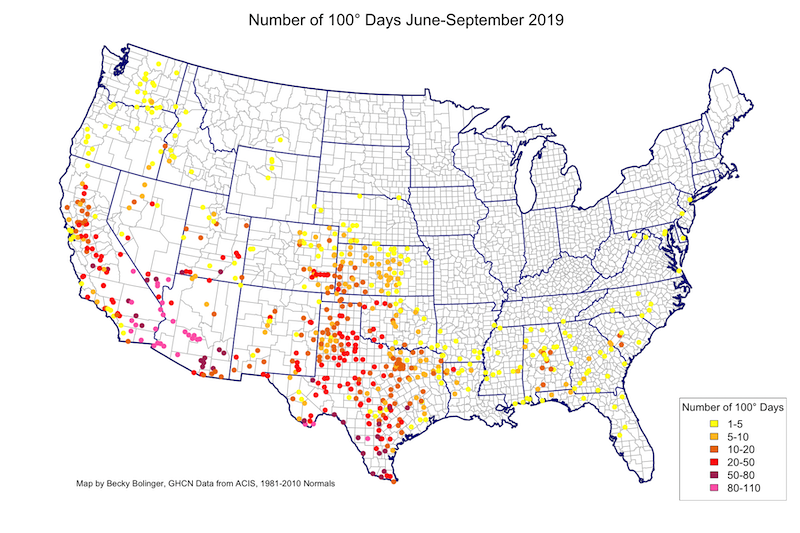
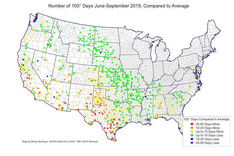
Now let’s look at how these counts compared to average. Using the 1981-2010 average number of 100° days for the same time period, the average was subtracted from the 2019 counts. Shift between the two maps and your eyes may immediately be drawn to the large number of green dots across the central U.S.
A lot of those green dots show up where there were no dots on the 2019 map – meaning these are locations that typically see one to a few 100° days in the summer but didn’t in 2019.
Notice how the pattern of less than average 100° days matches up with the cold and wet pattern seen on the first maps? Also notice how the driest areas in the southwest also coincide with areas of a higher than average number of 100° days. Also, with the exception of the eastern part of the state, most of Texas saw above average numbers of 100° days.
Check out your location on these maps. Did it match up with what you remember?
